
Checkout and Live Order Tracking
Choose fulfillment, address and payment against a clear price breakdown, then follow the order through to the door.
These images are illustrations of the concept, not screenshots of the actual product.
Overview
Checkout is where a browsing session either becomes an order or falls apart, and tracking is where trust in a local marketplace is won or lost. This concept covers both halves of that moment: a single-screen checkout that makes every charge visible before the order is placed, and a tracking view that keeps answering the only question a waiting customer has — where is it, and when will it arrive.
The checkout illustration keeps the whole decision on one scrollable mobile screen, grouped into plain cards. The delivery address sits at the top with a change action. Fulfillment is a three-way segmented control between delivery, pickup and on-location service, which matters in a catalog that carries both products and bookable services from the same cart. A compact item summary lists each line with its quantity and line price. Payment is a row of selectable methods — a mobile payment option, card and cash — with the chosen one marked by a check. The price breakdown then itemizes subtotal, tax, delivery fee and discount above a bold total, so nothing appears for the first time on a receipt. A full-width place-order button closes the screen.
Once the order exists, tracking turns it into a visible lifecycle. The order reference sits above a large estimated arrival time, and a vertical timeline shows the stages — placed, confirmed, preparing, out for delivery, delivered — with completed stages checked, the current stage emphasized, and the remaining one dimmed. Below it, a map draws the route between the merchant pin and the delivery pin with the courier's position along it, plus zoom and recenter controls. A courier card gives a first name, a vehicle chip, and call and chat actions, and a summary bar pins the merchant, item count and total to the bottom of the screen.
Both screens are the customer-facing side of machinery that runs elsewhere in the product. The stages on the timeline are the same order lifecycle a merchant advances from the order queue, the courier on the map is envisioned as a worker who accepted a dispatched task, and the totals shown here are what later appears in order history, reorder and the merchant's revenue analytics. Keeping the same states visible on every side is what makes a single order answerable end to end.
What this concept shows
- A one-screen checkout grouping the delivery address with a change action, fulfillment, items, payment and totals into separate cards
- A segmented fulfillment control covering delivery, pickup and on-location service
- An item summary listing each line with its quantity and line price
- Selectable payment methods — mobile payment, card and cash — with the active choice marked by a check
- An itemized price breakdown of subtotal, tax, delivery fee and discount above a bold total
- A five-stage order timeline with completed, current and pending states clearly distinguished
- A route map with merchant and destination pins, the courier's position, and zoom and recenter controls
- A courier card with a vehicle chip and call and chat actions, over a pinned order summary bar
How it works
- The shopper arrives at checkout from the cart and confirms or changes the delivery address.
- They pick a fulfillment mode — delivery, pickup or an on-location service visit.
- They review the item summary, with each line showing quantity and line price.
- They choose a payment method from the available options.
- They check the itemized breakdown of subtotal, tax, delivery fee and discount against the total, then place the order.
- The order opens in tracking with a reference, an estimated arrival time and a stage timeline that advances as the merchant works.
- Once the order is out for delivery they follow the courier on the map and use call or chat if something needs saying.
Who it's for
- Shoppers placing and following local orders
- Cart owners who need customers to see accurate totals
- Delivery workers contacted through the tracking screen
- Support teams answering order status questions
- Product teams designing checkout and fulfillment flows
Illustrations
2 illustrations of this concept. Select one to view it full size.
Checkout With Fulfillment, Payment and Totals
This illustration shows checkout on a tall mobile screen, with a back arrow and a centered title. Stacked cards carry each decision in turn. The first holds the delivery address — a recipient name and street address as sample data — with a change link on the right. The second offers fulfillment as a three-way segmented control with delivery selected and pickup and on-location beside it. The third summarizes the order as two line items, each showing a quantity multiplier and its line price in rupees. The fourth presents payment methods as three tappable tiles for a mobile payment option, card and cash, with the first selected and marked by a check badge. The fifth itemizes subtotal, tax, delivery fee and discount on separate rows above a ruled line and a bold total. A full-width place-order button sits below. All figures shown are sample data.
Live Order Tracking With Status Timeline
This illustration shows live order tracking on a tall mobile screen inside a device frame. A small order reference sits above a large estimated arrival line set in the accent color. A card below draws the lifecycle as a vertical timeline: placed, confirmed and preparing are marked with filled check circles, out for delivery is the current stage in bold with a highlighted marker, and delivered remains dimmed and unchecked. Beneath it a map card plots a dashed route between a merchant pin and a home pin, with an illustrated courier on a scooter partway along and zoom and recenter controls stacked at the edge. A courier card follows, pairing an illustrated avatar with a first name, a chip naming the vehicle type, and side-by-side call and chat buttons. A summary bar pinned to the bottom repeats the cart name, item count and order total. Names and figures are sample data.
Topics
- mobile checkout flow
- delivery pickup or on-location
- order price breakdown
- tax and delivery fee transparency
- payment method selection
- live order tracking
- order status timeline
- delivery map and ETA
- contact the delivery partner
- place an order app concept
Related concepts
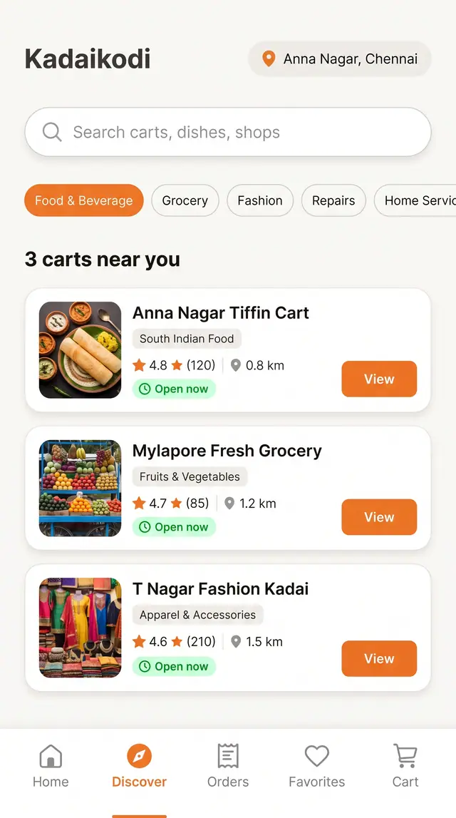
Discover Nearby Carts and Shops
Search, filter and browse open carts near you, then open one and build an order from its menu.
4 illustrations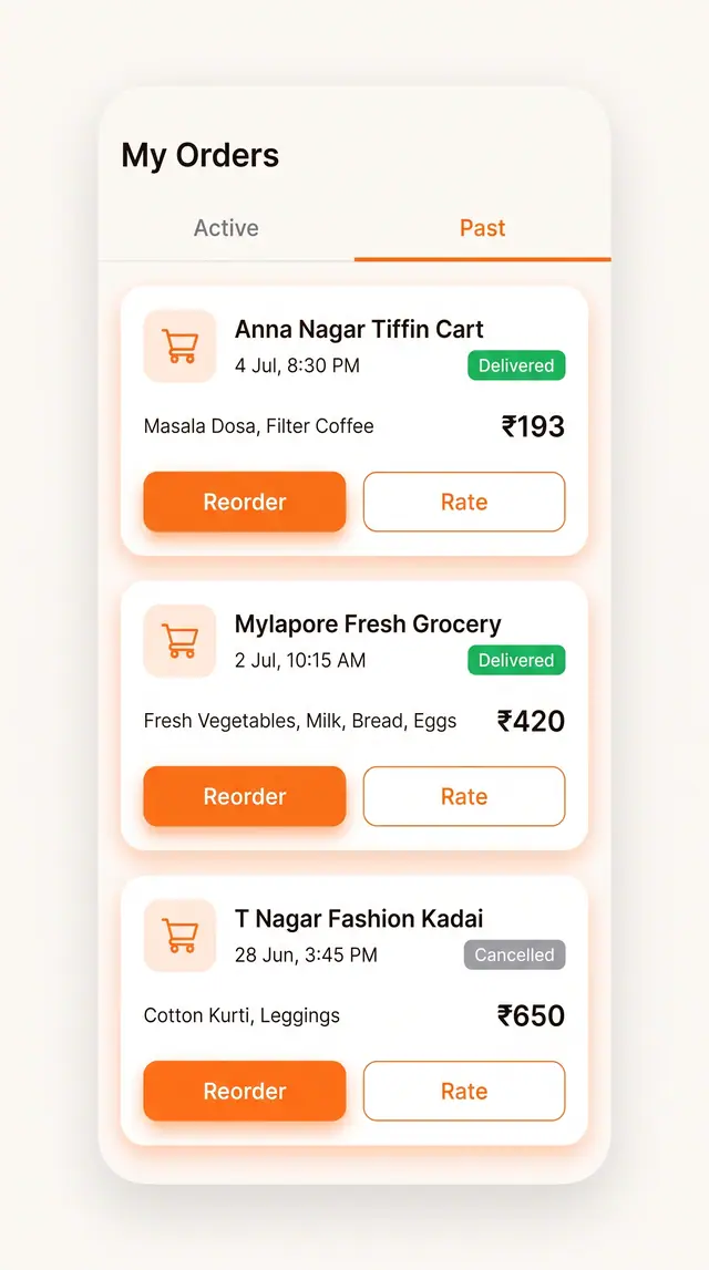
Order History, Favorites and Reorder
Past orders and saved carts sit one tap away from a repeat purchase, with rating close at hand.
2 illustrations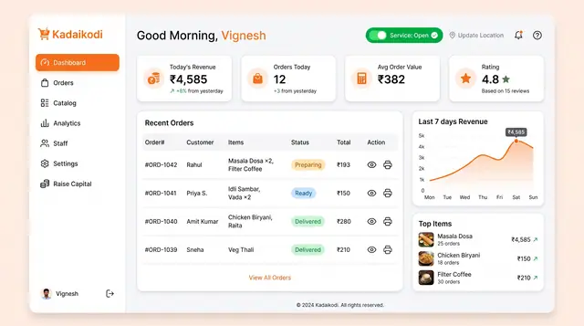
Merchant Dashboard and Order Lifecycle
See the day's revenue, orders and rating, open the storefront, and move each order from new to dispatched.
2 illustrations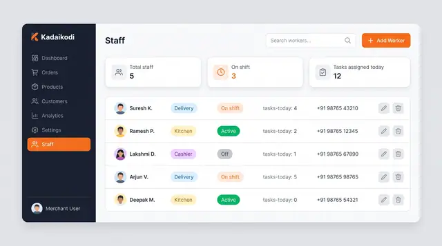
Staff Roster and Delivery Task Dispatch
A merchant roster and a worker app that turn shift status into assigned deliveries, guided task steps and weekly availability.
4 illustrations