
Discover Nearby Carts and Shops
Search, filter and browse open carts near you, then open one and build an order from its menu.
These images are illustrations of the concept, not screenshots of the actual product.
Overview
Street carts and small shops are the hardest kind of seller to find online. They are close by, they open and close on their own rhythm, their range is small, and the thing a shopper actually wants to know is simple: what is open right now, within walking distance, and is it any good. This concept covers the discovery surface that answers those questions and the merchant page a shopper lands on once they pick one.
The customer app opens on a discovery feed scoped to a chosen locality. A search field spans carts, dishes and shops, a row of category chips narrows to food, grocery, fashion, repairs or home services, and the results are counted in a plain heading — carts near you. Each result card pairs a photograph with the cart name, a category tag, an average rating with its review count, the distance in kilometers, an open-now indicator, and a view action. Nothing about the card is decorative: every element is a reason to tap or skip.
Opening a cart leads to a merchant page built around the same facts. A wide photo of the stall sits above the name, rating and review count, an open state with a closing time, distance, and a category tag. Tabs separate the menu from reviews and shop information. The menu itself is grouped into named sections, and each offering is a row with a thumbnail, a short description, a price and a single add control, so a shopper builds an order without leaving the page. A persistent bar along the bottom tracks the item count and running total and leads to the cart.
Two further illustrations show the same discovery idea in different contexts. A dark-theme variant renders the identical feed — location chip, search, category chips, result cards with ratings, distance and open-now pills, and the five-tab bar — proving the surface is themed rather than redrawn. A wide web layout explores discovery driven by a typed sentence: the query resolves into removable filter chips for category, a price ceiling, open-now and a distance limit, results appear as cards with open and closed states, and a side panel explains why each result was shown. A small badge beside the query and a footer note separate intent understanding and personalized ranking from the filtered results drawn on the page.
Discovery is where the rest of the customer experience starts. The cart a shopper opens here is the one that flows into checkout, order tracking, reviews and favorites, and it is the same merchant record that an owner configured during onboarding.
What this concept shows
- A locality chip in the header that scopes the whole feed to a chosen neighborhood
- A single search field covering carts, dishes and shops, with scrollable category chips for food, grocery, fashion, repairs and home services
- Result cards carrying a photo, category tag, average rating with review count, distance in kilometers, an open-now pill and a view action
- A merchant page with a hero photo, rating, closing time, distance and category, split into menu, reviews and information tabs
- A menu grouped into named sections, with each offering showing a thumbnail, description, price and a one-tap add control
- A sticky cart bar tracking item count and running total while the shopper browses
- A dark theme variant of the same discovery feed, with identical cards, pills and controls
- A wide web layout that turns a typed sentence into removable filter chips and pairs results with a panel explaining why each one appeared
How it works
- The shopper opens the discovery feed and confirms or changes the locality in the header chip.
- They narrow by category chip, or type into the search field across carts, dishes and shops.
- They compare the returned cards on rating, review count, distance and open-now state.
- They open a cart and read its hero, rating, closing time and category before browsing the menu tabs.
- They add offerings section by section, watching the item count and total build in the bottom bar.
- They continue to the cart when the order is complete, or switch tabs to orders and favorites.
- On a wider screen the same intent can be typed as a sentence, refined by removing filter chips, and checked against the panel explaining the results.
Who it's for
- Shoppers looking for open carts and shops nearby
- Residents ordering food, groceries and local services
- Cart owners who want to be found by people close by
- Product and design teams shaping local marketplace search
- Marketplace operators tuning category and location filters
Illustrations
4 illustrations of this concept. Select one to view it full size.
Nearby Carts Feed With Category Filters
This illustration shows the customer discovery feed on a tall mobile screen. The header pairs the wordmark with a locality chip carrying a map pin, so the feed is visibly scoped to one neighborhood. A rounded search field below invites searching across carts, dishes and shops. A horizontally scrolling row of category chips follows — food and beverage selected in the accent color, with grocery, fashion, repairs and home services trailing off the edge. A plain heading counts the carts near the shopper. Three result cards each place a photograph on the left and, on the right, the cart name, a category tag, an average rating with its review count, the distance in kilometers, a green open-now pill and a filled view button. All names, ratings and distances are sample data. A five-item tab bar for home, discover, orders, favorites and cart anchors the screen, with discover active.
Merchant Page and Menu Ordering
This illustration shows a single merchant's page on a tall mobile screen. A wide photograph of a street stall fills the top with the wordmark overlaid. Under it the cart name is followed by a summary line combining an average rating, a review count, an open state with a closing time and the distance, plus a category tag. Three tabs separate the menu, reviews and shop information, with the menu active and underlined in the accent color. The menu is grouped under a section heading, and each offering is a card with a square thumbnail, its name, a one-line description, a price in rupees and a round add button on the right. A second section heading begins below, showing the list continues. A pinned bar across the bottom shows the running cart as an item count and total, and acts as the button into the cart. Items and prices are sample data.
Dark Theme Discovery Variant
This illustration shows the discovery feed rendered in a dark theme inside a phone frame, presented as a theming variant of the same surface. The layout matches the light version: wordmark and locality chip in the header, a rounded search field with an accent-colored magnifier, and a row of category chips where the selected chip is drawn as an accent outline rather than a filled pill. The heading counting nearby carts gains a chevron suggesting a route to a fuller list. Each result card sits on a raised dark panel with a photograph, the cart name, a star rating with review count, a distance, a green open-now pill, a currency indicator for price level, and a filled view button whose accent color carries over unchanged. The floating bottom tab bar keeps the same five destinations with discover active. Names, ratings and distances are sample data.
Typed Intent Turned Into Filters
This illustration shows discovery on a wide dark web layout. A left sidebar groups navigation under discover, local shops, services with events and promotions, and settings with support. A top bar carries a locality selector, a global search field, a notification bell and an account avatar, with a breadcrumb and location chip beneath. The focus is a wide query field holding a typed sentence asking for something light, inexpensive, open now and within walking distance; a small badge beside it refers to intent understanding, and a footer note distinguishes filtered discovery from personalized ranking. A row of removable chips shows the resolved filters: a category, a price ceiling, open now and a distance limit. Results appear as a grid of merchant cards with a category tag, name, star rating, distance, price and an open or closed pill — the closed card showing an opening time with its action disabled. A side panel lists short reasons the results were chosen. All entries are sample data.
Topics
- find carts near me
- local shop discovery app
- nearby merchant search
- category filters and open now
- street food cart menu
- add to cart from menu
- dark mode mobile marketplace
- natural language search filters
- hyperlocal commerce discovery
- distance and rating sorting
Related concepts
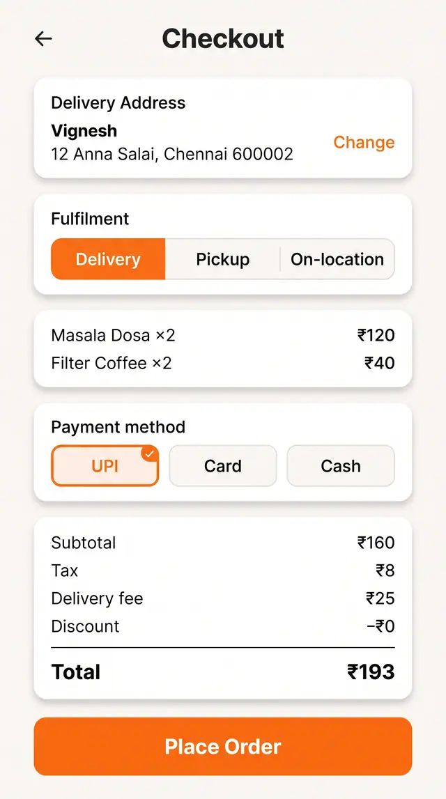
Checkout and Live Order Tracking
Choose fulfillment, address and payment against a clear price breakdown, then follow the order through to the door.
2 illustrations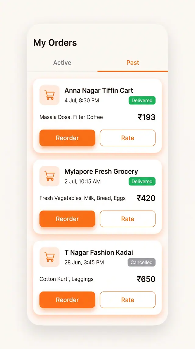
Order History, Favorites and Reorder
Past orders and saved carts sit one tap away from a repeat purchase, with rating close at hand.
2 illustrations
Ratings, Reviews and Owner Responses
An aggregate score, a star-by-star breakdown, a quick review form and visible owner replies on one screen.
1 illustration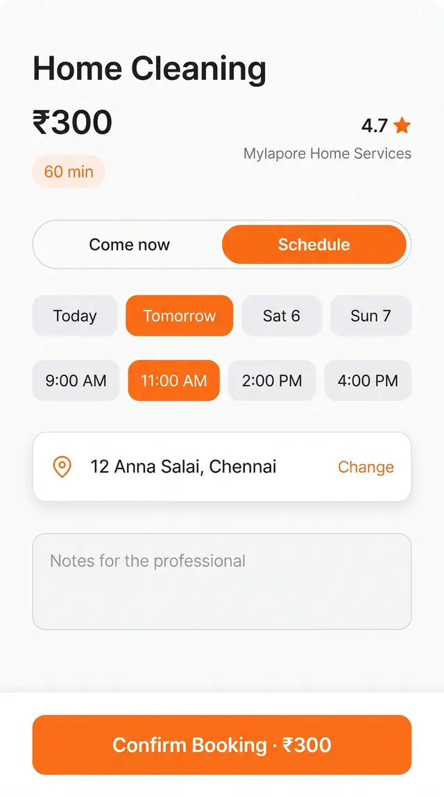
Service Appointment Booking
Book a home or personal service for right now or a chosen slot, with address, notes and price on one screen.
1 illustration